Things to Consider when Designing Complication Layouts
Most Fowziya Akther Houya
Engineer, Samsung Developer Program
Watch Face Studio is an intuitive graphical tool that provides designers a means to design watch faces without jumping into complex coding. Complication design is a major feature of this tool, and layout is a vital property of complications. The layout enables you to place components as you wish to create eye-catching watch faces. To learn more about complications, see the Design Complications Using Watch Face Studio blog post.
Watch Face Studio has six complication types:
-
Short text
-
Monochromatic image
-
Ranged value
-
Long text
-
Small image
-
Large image
Each complication has a set of layout options. You can use the layout to present information in a coherent way and make important elements stand out.
This article introduces three important behaviors that you must keep in mind when working with complication layouts.
Blank elements in the default layout
Some complication providers do not provide data for all the components on a complication. Elements without data remain blank on the watch face.
For example, Figure 1a shows the default layout for the short text complication. It displays the icon, title, and text from the provider. The "Step count" provider does not include an icon. If the default layout is used with the "Step count" provider, the watch face is blank where the icon is normally displayed, as shown in Figure 1b.

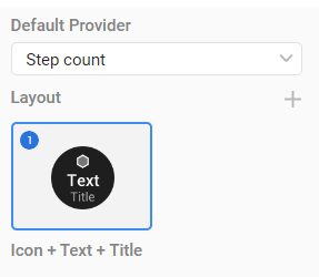
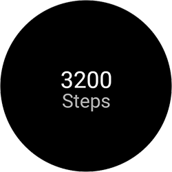


Figure 1: Blank icon slot for Step count

Specifying a single layout
Watch Face Studio provides four possible layouts for the short text complication. To implement one specific layout only, you must remove the unwanted layouts from the layout list. For example, if you want to use only the "Icon + Text" layout, select it and remove the others.

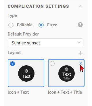
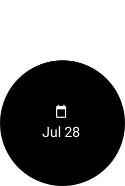


Figure 2: Setting a specific layout

Components moving between layouts
As previously discussed, complication components appear blank when there is no data provided for them. To avoid displaying blank components, you can implement multiple layouts. In this case, the watch automatically selects the appropriate layout based on the complication provider.
Components changing position
This section demonstrates an issue commonly faced when implementing multiple layouts. When the watch switches between layouts, the position of complication components can change undesirably.
In Figure 3, a short text complication has been selected. To visualize the original position of each component, rectangles have been drawn around them, matching the component boundaries.
When the default provider is set to "Sunrise sunset" and the default "Icon + Text + Title" layout is selected, the Run preview shows the icon and text displaying perfectly within the bounded area.
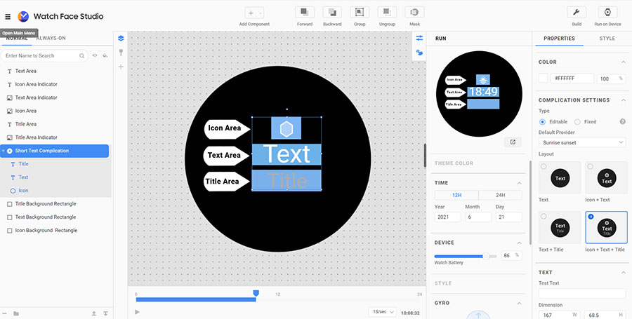
Figure 3: Visualizing the positions of the default layout components
Figure 4 shows what happens when the layout is switched to "Text + Title." The components’ positions have changed and are no longer aligned with our rectangles.
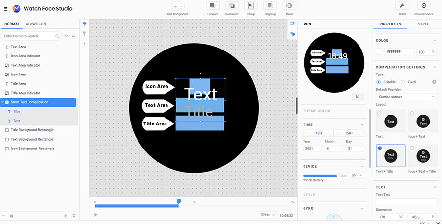
Figure 4: Complication components changing position between different layouts
In Figure 5, the watch face has been deployed. Customizing the complication reveals that the components do not consistently display in the same location. For example, with the "Bixby" or "Barometer" providers, the components are in the appropriate positions. However, the components of "Feels like temp." and "Step count" are not in alignment.

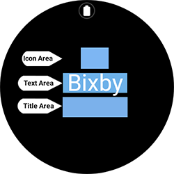
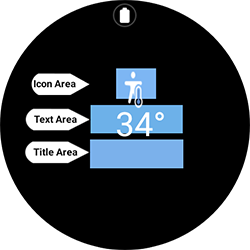


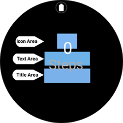
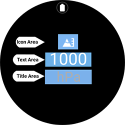


Figure 5: Complication components changing position between different layouts on an actual watch

Fixing the position of complication components
This section demonstrates how to make the position of complication components consistent, where the end result is the fixed layout. This resolves the problem of components changing position between layouts. You can follow along with the demonstration by downloading the sample project.
To fix the position of complication components:
- In Watch Face Studio, add a short text complication.
- To create a rectangle, select Add Component > Shape > Rectangle.
NoteInstead of a rectangle, you can also use an ellipse. - Adjust the position and size of the rectangle to fit the entire layout.
- Set the opacity of the rectangle to 0%.
The rectangle becomes invisible.
NoteIn the sample project, for demonstration purposes, the rectangle’s opacity has been set to 20%. - Give the shape a descriptive name, such as “Icon, Text, Title Background.”
- Add the rectangle to the Short Text Complication layout, placing it beneath the Icon component.

Figure 6: Adding the rectangle to the layout
- Add the remaining layouts ("Text + Title," "Icon + Text," and "Text") to the complication.
- Repeat steps 2 to 6 for each layout you want to implement.
The following figure shows the result in Watch Face Studio.
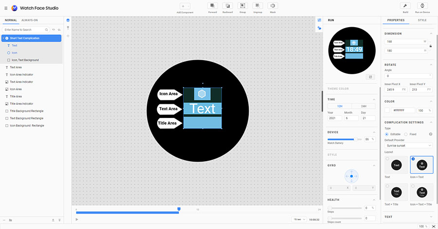
Figure 7: Watch Face Studio view after adding background rectangle
When the project is deployed to the watch, the complication components stay in the same place even when switching between layouts.

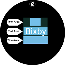
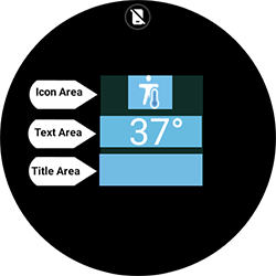


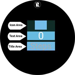
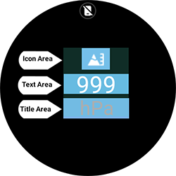


Figure 8: Consistent component position between different layouts

Conclusion
Watch Face Studio provides various layout options for the watch face. The layout considerations described in this blog can help you create an effective layout that enhances and communicates your design to the user.
Resources
For more information about complications, see Build complications in Watch Face Studio. You can also visit the Samsung Developers Forum, an active and friendly community where you can ask for and receive help with your application development.
The Samsung Developers site has many resources for developers looking to build for and integrate with Samsung devices and services. Stay in touch with the latest news by creating a free account and subscribing to our monthly newsletter. Visit the Marketing Resources page for information on promoting and distributing your Android apps.


