Improving web performance with responsive design
Laura Morinigo
Web Developer Advocate
Making your web app adaptive following responsive design techniques can improve your performance score, here is how.
The benefits of applying responsive design include boosting your SEO, having a better user experience on different devices, and making your website more accessible, but did you know that making your web app adaptive to different viewports can also improve your web performance score? In previous articles, we explained the current status of responsive design including dark mode and responsive design for foldables, and we even share some insights about its future, now let’s deep dive into how web performance is related to an optimized look and feel.
Web Performance Metrics
The first step to improving something is to measure it! Being aware of what metrics that we should collect to later compare results that will show us which aspects of our web app needs more work. When it’s about web performance, we can use any of our favourite browser devtools, in this case, I will be using Lighthouse. There are many metrics to consider but when it’s about responsive design, Cumulative Layout Shift and CSS Optimization play an important role.
Cumulative Layout Shift
The first metric that we will use to achieve a responsive design is Cumulative Layout Shift, this is really important because is a user-centric metric and measures visual stability. How many times have you been on a website and suddenly you experience some changes in the layout? It's like the page moves by itself! This can lead to click on the wrong thing or lose your place whilst reading. Annoying right? We don’t want to offer that bad user experience! Let me show you an example and how we fixed it.
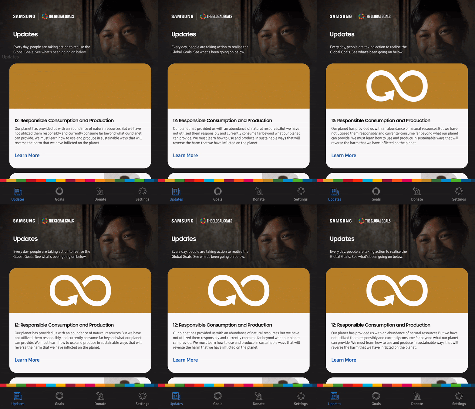
Last year we build the first prototype of Samsung Global Goals PWA in collaboration with the United Nations, our mission was to bring the native app to other platforms because we believe in the power of the outreach of the World Wide Web. This web app basically loads dynamic content like cards with images and text. One of our main goals was to deliver a fast app even if the connection was not reliable, then we tested the web app using a low bandwidth connection to see how it goes. The results were not bad but as we had dynamic images loading, our cards changed the size while it completes the download of the resources. This looks really bad, therefore it deserves a fix (and an apology to the user).

How do we fix this? It’s pretty simple, if you have the same problem using images, always set up height and width.

If you have dynamic content like us on your web app or let’s say that you will show ads later, make sure to use placeholders specifically for this content. This is what we did, we used a placeholder with a background colour that matches the card and image, so images will load and cards won't move at all. Websites should strive to have a CLS score of 0.1 or less, by doing this we went from 0.33 to 0! Besides that, remember if your image is in a container you can use CSS to adjust the image to it by using height: auto and width: 100%
CSS Optimization
We usually rely on external CSS libraries to achieve a responsive design, there are a few things that we have to keep in mind to don’t mess up our performance if we do this. The techniques related to CSS optimization include reducing render-blocking CSS, eliminating unused CSS rules, and minify CSS.
I will focus on removing unused CSS since it’s one of the most common issues that we need to improve when using external resources. Actually, you can check if you have unused CSS on Lighthouse, for example, here is telling us that we are not using around 95% of our CSS, this is a lot!

How to detect unused CSS and remove it
If you are using an external library check if you have the option to export just the components that you will use instead. Another option is taking a look at how your web app is using the resources. You can try this on Chrome Dev tools, press CTRL + SHIFT +Pto open the command line, and type coverage. A new tab will appear where you will find how much percentage of your resources are being used. For example, the following CSS library has almost 40% of unused lines, same with other resources. If you click on a particular one you can even see which lines are used or unused indicated by different colors.

There are several libraries that can detect unused CSS and reduced your CSS file size, like Purify CSS, which is a JS library that you can install with npm or directly use purify CSS online. It will not only show you the amount of unused code it will also create a new CSS file with just the code that you currently need.
🚀Performance and Responsive Design are correlated
Just in case that you were not clear about the multiple benefits of responsive design, now you can add one more to this list: making your web app faster and more performant. Which are your favorite performance tools?


