Redeeming Push Notifications
Ada Rose Cannon
Web Developer Advocate
Push notifications have a terrible reputation but if done well can give your users a positive experience.
You know that thing where you go to a web site then, before you can do anything, you have to acknowledge the push notification request. Do you hate that? Yeah, me too.
Jo Franchetti even wrote an entire article about the crisis of websites bombarding people with permission requests and dialogs when they first arrive on the page.
A Crisis of Permissions
That’s just one of the many ways it’s easy to upset your users with push notifications, this article will try to detail some ways to do them better.
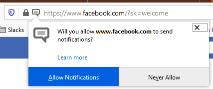 A bad example of requesting for push notifications on first load
Failing before you even begin
Push Notifications on the Web are one of the most maligned APIs on the Web and this is one of the reasons why. It’s possible to give a bad impression before you even send a single notification.
Just like you wouldn’t ask to move in with someone on the first date, do not ask to send notifications on the very first user engagement.
Assume your users do not want push notifications. Prove the worth of your web app with it’s high quality information and delightful user experience. Make the users want push notification before you prompt them, the best way to do this is to have a checkbox to enable push notifications in context.
This makes it clear not only what the push notification request is for but how they can turn them off when they do not want them.
In this example app users can turn on notifications for particular information channels with the “notify me on updates” checkbox:
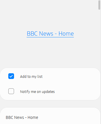
If they check the checkbox then we will call pushManager.subscribe() which will prompt the user to enable notifications. The users are more likely to enable push notifications because they chose to be prompted through their own intuition.
On a related note app install banners:
In some browsers, app install banners, pop up in a similar way to poorly done notification requests. It is not in response to a user action and are unrelated to your app’s content and not part of your apps user interface.
It is possible to integrate this into your app interface, letting you hide this banner and letting you provide your own install button.
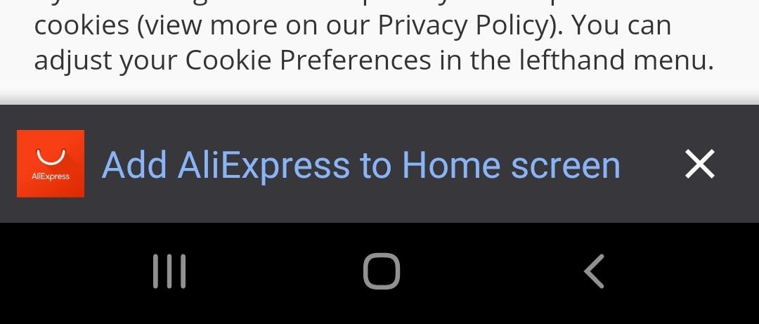
Do this in the beforeInstallPrompt event:
window.addEventListener('beforeinstallprompt', handleInstallPrompt);
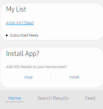
You can use this event to integrate an App Install Button into your app. If you get this event then you can show the button which allows the content to be installed. In the below image I put a subtle bubble at the bottom of the homepage for installing it. It’s easy to find and access but won’t intrude on the user’s app experience.
The user pays the cost of notification, don’t be expensive.
The user doesn’t pay a cost in money but they do in attention.
Each notification is a weight upon the user’s mind. A notification to a user when their attention is at their limit could be the motivation the user needs to block all notifications from the entire web browser.
Each notification should bring joy to the user. How do you bring joy?
- Be timely
If you could’ve given this information earlier or could show it later why bother interrupting the user right now.
Bad notification: ‘Did you know you can send money with our app’
Good Notification: ‘Alice has sent you $20’
- Be efficient
Opening an app or web page is comparatively slow, it can take a few seconds which is a long time to someone who is busy cooking dinner or watching Netflix or at work.
If you can put all the information in the notification without them opening the app then do that. If all the response you need is a simple Option-A/Option-B question such as yes/no then add those buttons.
When the user presses the button update the notification to acknowledge the button press but don’t open the app.
Eve has requested $15
[Send Now] [Decline]
- Be clear
There are many options to change the appearance of the notification use as many as possible to make it clear where the app is from, what it’s about and what action is expected from the user.
Use the badge and icon for your app icon. Use the title to give a summary of what action the user needs to take, use the body and image to give relevant information and context.
The next section describes how to customise your notificaition.
- DO NOT WASTE THE USER’S TIME
Don’t push ads, don’t use them to beg users to return, don’t push boring notifications to remind the user your web app exists.
I know it’s tempting and you have quotas to meet but it will only have an adverse effect on how the user views your app and notifications as a whole. The user probably does not love your app as much as you do and will be a lot less forgiving.
Fully Customising Push Notifications
Here is an example notification where as much as possible has been configured:
{
  body: "Awkward Zombie - Disagree to Agree",
  icon: "/icons/appicon.png",
  image: "https://example.com/previewimage.jpg",
  badge: "data:image/png;base64,iVBORw0KGgoAAA...",
  vibrate: [100, 50, 100],
  data: data,
  tag: data.url,
  actions: [
    {
      action: "Read now",
      title: "Open"
    },
    {
      action: "close",
      title: "Close"
    },
  ],
};

self.registration.showNotification(title, options);
If assets take too long to load they get ignored. The most important icon is the badge icon since it’s the one which gets put into the status. It’s also very small so is ideal to be URL encoded and is kept in a constant in the Service Worker file, to ensure it is loaded reliably.
For the icon we use the app icon so it’s extra clear where the notification is from. This is a locally loaded PNG to be sure it loads quickly.
The image is loaded from the third party site the being loaded from the RSS feed we don’t need to have it store local it’s okay for these to be from somewhere else. It adds good context but it isn’t essential so if it does not load in time then it’s not an absolute problem.
These examples of action buttons I’ve done here are probably not totally necessary since notifications can be closed by some other means and we can just listen for notification clicks. Better examples would be something like “Open” and “Remind me Later”, defaulting to “Open” if neither button is clicked.
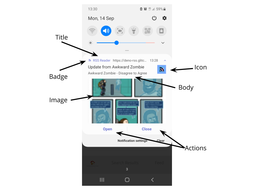
Detailing the different parts of the notification
Combining notifications
You can’t guarantee a user will check their device in between notifications. New notifications by default do not replace the the old ones so this can result in an overwhelming flood of notifications if they arrive in short succession.
If you set the tag property then notifications which share the same tag can overwrite each other. In this example the tag is set to the RSS feed’s URL, so that notifications from the same RSS feed overwrite each other.
This is better since we don’t get flooded but now if a second notification comes through we lose the first one. It’s probably a good idea to check to see if you are replacing a notification and if you are concatenate them together.
const existingNotifications = await self.registration.getNotifications({
  tag: data.url,
});

if (existingNotifications.length) {
  const oldNotification = existingNotifications[0];
  options.body = oldNotification.body + '\n' + options.body;
}
There is a limited amount of text that can be fit into a notification body. An alternative solution would be to replace the notification with one that just says ‘You have N notificaitons’ then when the user taps on it open your Web App’s notification interface.
Updating Notifications
This can also be a good way to update the user in notification only interfaces. Once they have click on the notification to perform an action make, the request to the server to perform that action. Once the request completes then show a new notification acknowledging it’s completion.
self.addEventListener("notificationclick", async function (e) {
  const notification = e.notification;
  const action = e.action;

if (action === "close") {
    notification.close();
  }
  if (action === "respond") {
    // close the old notification
    notification.close();

    const response = await fetch('/api/respond.json')
      .then(r => r.json());

    // Let the user know if it succeeded or not
    if (response.ok) {
      self.registration.showNotification("Success", options);
    } else {
      self.registration.showNotification(response.error, options);
    }
  }
});
By having the user interact only through push notifications the user can complete their task and have a positive interaction with your app without needing to dedicate much mental energy to it giving a positive experience.
Together we can use push notifications to enrich people’s lives and make users have a positive association to push notifications.


